Marvelous Misadventures in Bioinformatics
A blog on some snippets of my work in bioinformatics. Hopefully you find something useful here and avoid stupid mistakes I made.
Plotting Pairwise matrices
When comparing classes in a biological setting, pairwise matrices are a great way to visualise the relationship between these classes. I will be using simulated data to represent a hypothetical pairwise similarity between 4 groups.
I will be showing you how to plot a heatmap of pairwise matrix and using the mask fucntion to reduce redundancy
Prerequisite
- numpy
- pandas
- matplotlib
- seaborn
Installation
- None
Usage
-
Import libraries
 import pandas as pd
 import numpy as np
 from matplotlib import pyplot as plt
 import seaborn as sns
Note: It’s good practice to import numpy/pandas first, then matplotlib and seaborn
-
Simulate a pairwise matrix
 mtx = [[0, 0.3, 0.4, 0.5], [0.3, 0, 0.5, 0.6], [0.4, 0.5, 0, 0.7], [0.5, 0.6, 0.7, 0]]
 mtx = pd.DataFrame(mtx)
 print(mtx)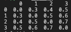
-
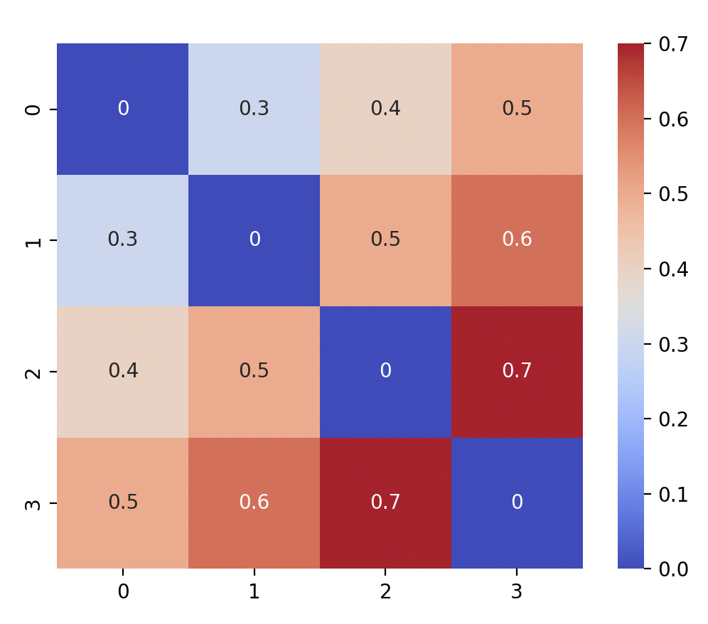
Plot the heatmap using seaborn
 sns.heatmap(mtx, annot = True, cmap = "coolwarm", square = True)
 plt.show()
You should see:
-
Since the top right triangle is the same as the bottom left. We can remove the top right by using a mask to remove the plots by using the
np.triufunction.mask = np.triu(np.ones_like(mtx, dtype=bool)) sns.heatmap(mtx, annot = True, cmap = "coolwarm", square = True, mask = mask) plt.show()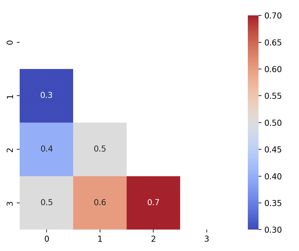
Alternatively, if you want to mask the bottom left triangle instead, use
np.trilinstead.mask = np.tril(np.ones_like(mtx, dtype=bool)) sns.heatmap(mtx, annot = True, cmap = "coolwarm", square = True, mask = mask) plt.show()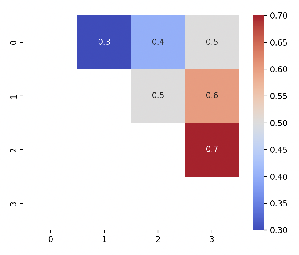
-
You can then proceed to add other annotation features such as title, axis labels.