Marvelous Misadventures in Bioinformatics
A blog on some snippets of my work in bioinformatics. Hopefully you find something useful here and avoid stupid mistakes I made.
On survival analysis and KM plots
“cie la vie”
In the context of biomedical sciences, survival analysis is used to study the relationship between time and outcome. More broadly speaking, ‘How likely is a non-reversible process X to have happened within T time?’.
This process is usually presented using a Kaplan-Meier (KM) plot. This tutorial will cover plotting a KM plot programmatically on a synthetic dataset using the lifelines package in Python.
Prerequisite
- lifelines
- numpy
- pandas
- matplotlib
Installation
pip install lifelines
Usage
-
Import packages and initialise the Kaplan-Meier Fitter
import pandas as pd import numpy as np from lifelines import KaplanMeierFitter from lifelines.statistics import logrank_test import matplotlib.pyplot as plt kmf = KaplanMeierFitter() np.random.seed(42) #set a seed for reproducibility -
Define patient and group functions
To begin with, define the studypatient class, with each patient carrying the status and group information.
 class studypatient:
     def __init__(self, group, status):
         self.group = group
         self.status = status
Let’s also define two functions, each for the gorup of ‘control’ and ‘sick’ patients.
For the control group, let’s say the probability of an event is a fixed 0.01 (1 in 100).
 def controlgroup(nsize, totaltime) -> pd.DataFrame:
     currenttime = 0
     df = pd.DataFrame(columns=['time', 'event', 'group'])
     groupname = 'control'
     patients = [studypatient(groupname, 0) for _ in range(nsize)]

     while currenttime < totaltime:
         for _, patient in enumerate(patients):
             if np.random.randint(1, 101) == 1: #hitting an event
                 if patient.status == 0: #check if patient have occured the event
                     patient.status = 1 #update patient status
             df = df._append({'time': currenttime, 'event': patient.status, 'group': groupname}, ignore_index=True)
         currenttime += 1
     return df
For the sick group, let’s say the probability of an event is higher at 0.05 (1 in 20).
def sickgroup(nsize, totaltime): currenttime = 0 df = pd.DataFrame(columns=['time', 'event', 'group']) groupname = 'sick' patients = [studypatient(groupname, 0) for _ in range(nsize)] while currenttime < totaltime: for _, patient in enumerate(patients): if np.random.randint(1, 21) == 1: #hitting an event if patient.status == 0: #check if patient have occured the event patient.status = 1 #update patient status df = df._append({'time': currenttime, 'event': patient.status, 'group': groupname}, ignore_index=True) currenttime += 1 return df -
Initilize the data in the groups
In this example, let’s do 100 patients in each group for 50 time units.
controldf = controlgroup(100, 50) sickdf = sickgroup(100, 50) df = pd.concat([controldf, sickdf]) df.head() -
Plot the Kaplan-Meier plot
First we need to get the indexes and the vectors representing the time and event.
 groups = df['group']
 T = df['time']
 E = df['event']
 ix = (groups == 'control') #indexs for the control group
We then fit the control group plot first.
 kmf.fit(T[ix], E[ix], label = 'control')
 ax = kmf.plot_survival_function(color = 'blue') #blue for the control group
Followed by the sick group plot.
 kmf.fit(T[~ix], E[~ix], label = 'sick') # the ~ here means negation, so NOT control group indexes
 ax = kmf.plot_survival_function(color = '#E0218A') #lets do barbie pink
Optional: For better labelling. lifelines uses the matplotlib backend, so plt functions can be used as normal.
plt.ylabel("Percent survival (%)") plt.xlabel("Time (AU)")plt.show()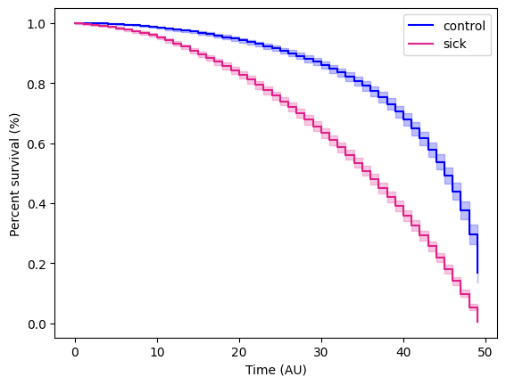
-
Statistical test
Once finishing the KM plot, we would want to run a statistical test to see if there is a statistical difference between the two groups. In this instance, we can do a log rank test.
First get the vectors for the two groups.
 T_control, E_control = df.loc[ix, 'time'], df.loc[ix, 'event']
 T_sick, E_sick = df.loc[~ix, 'time'], df.loc[~ix, 'event']
Then run the test.
 logrank = logrank_test(T_control, T_sick, event_observed_A = E_control, event_observed_B = E_sick)
 print(logrank.p_value, logrank.test_statistic)
will yield a p-value and test statistic of 5.3049732426876005e-180 and 818.4319348037003 respectively, this means that there are statistically significant difference between the control and sick group.
Reference
- https://github.com/CamDavidsonPilon/lifelines/